SCOPE OF WORK:
Graphic Design, Brand Identity Art Direction.
CLIENT:
NIDO
CONCEPT:
Nido is the place to get carried away by all the birds in your head. A place where the food is cuisine d'auteur, the coffee is specialty and creativity flutters in every bite. A space where the product is as fresh as the ideas and each meal is elevated to the category of art.
Nido is the ability to innovate, to dare, to leave behind the fear of flying. Nido is nothing more than the art of Food in Motion.

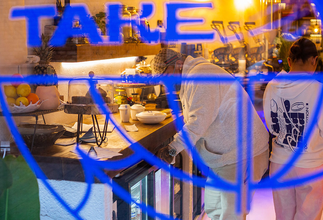
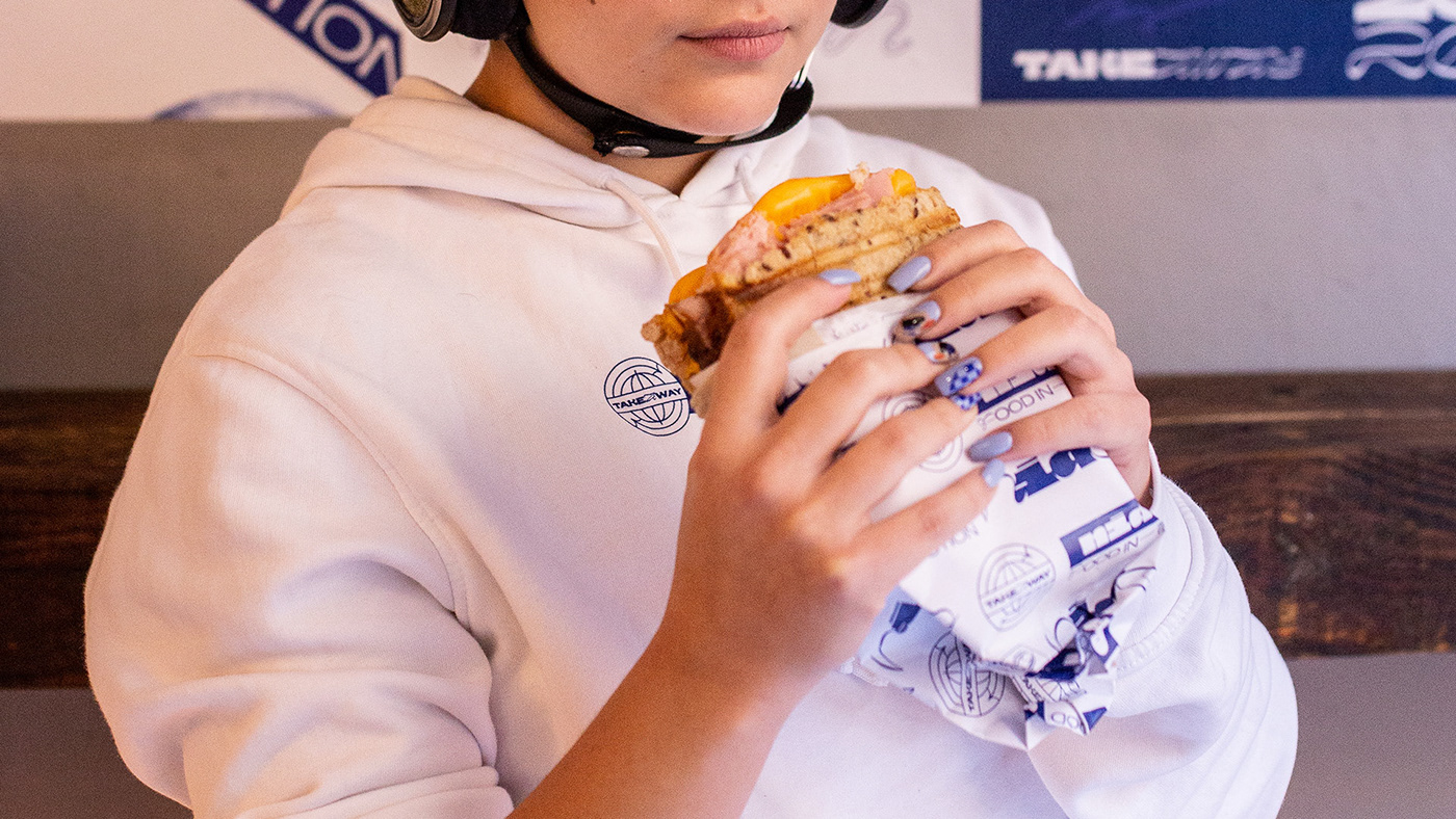
The concept of Nido was born from being the refuge, the meeting point of "traveling kitchen". Nido is a signature take away food restaurant. A place where food is always in motion, both because of the format and because of the renewal of its products, always fresh, from the market and different every day. In Nido you will not find a daily menu, you will find creative and gastronomic surprises.
Precisely for this reason, the identity needed to drink movement, freshness and renewal. It was decided to bet on two main typographic variants, including one with calligraphic typology. The colors are marked by the blue of Yves Klein given the close relationship between the environment and art: the products always cater to the category of food design and the exhibitions of photographers, designers and artists merge with the variety of crockery in the space.